Hurricane Florence
Contents
Hurricane Florence#
Jupyter Info
Reminder, that on this site the Jupyter Notebooks are read-only and you can’t interact with them. Click the button above to launch an interactive version of this notebook.
With Binder, you get a temporary Jupyter Notebook website that opens with this notebook. Any code you write will be lost when you close the tab. Make sure to download the notebook so you can save it for later!
With Colab, it will open Google Colaboratory. You can save the notebook there to your Google Drive. If you don’t save to your Drive, any code you write will be lost when you close the tab. You can find the data files for this notebook below:
You will need to run all the cells of the notebook to see the output. You can do this with hitting Shift-Enter on each cell or clicking the “Run All” button above.
Overlay - Hurricane Florence#
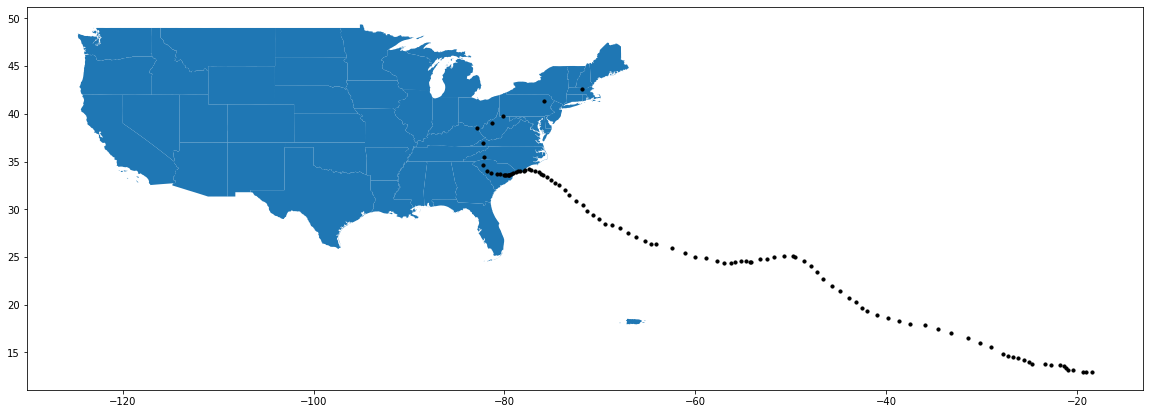
For this example, we want to see a real-life application of a join. Our final product is intended to be a map of the US, with the Hurricane Florence path on top of it, where we have highlighted the states hit by Hurricane Florence in blue.
We start by importing as before and repeating the work we did from the last lesson to plot the hurricane path on top of the map of the US. Remember, the cell to translate Hurricane Florence data to a GeoDataFrame is necessary, but not important to understand how we do it. As a brief recap:
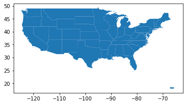
We load in the US dataset into a variable called
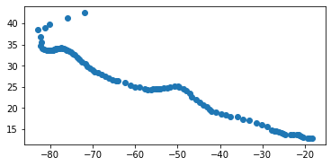
countryand filter out Hawaii and Alaska for visibilityWe load in the Hurricane Florence dataset and convert its
LatandLongcolumns to a single column of Point geometries. We then convert thatDataFramewith a geometry column (calledcoordinates) to aGeoDataFramethat is aware of that geometry.We plot the two on top of each other by making a
FigureandAxesand having bothGeoDataFramesdraw themselves on that oneAxesax.
import geopandas as gpd
import matplotlib.pyplot as plt
import pandas as pd

# A special command for Notebooks to get the plots inline
%matplotlib inline
# Load in US Data
country = gpd.read_file("gz_2010_us_040_00_5m.json")
country = country[(country['NAME'] != 'Alaska') & (country['NAME'] != 'Hawaii')]
country.plot()
<matplotlib.axes._subplots.AxesSubplot at 0x7f071ba540d0>
from shapely.geometry import Point

# Load in Florence data
florence = pd.read_csv('stormhistory.csv')
florence['coordinates'] = [Point(-long, lat) for long, lat in
                           zip(florence['Long'], florence['Lat'])]
florence = gpd.GeoDataFrame(florence, geometry='coordinates')
# Advanced: Need to specify map projection points so we can join them later
florence.crs = country.crs

florence.plot()
<matplotlib.axes._subplots.AxesSubplot at 0x7f071ba1c280>
# Plot both on top of each other
fig, ax = plt.subplots(1, figsize=(20,10))
country.plot(ax=ax)
florence.plot(ax=ax, color='#000000', markersize=10)
<matplotlib.axes._subplots.AxesSubplot at 0x7f071b9029d0>
Joining Geospatial Data#
So if our goal is to highlight the states that were hit by Hurricane Florence, we will need some way to “line up” the two datasets so we know which rows in the US dataset correspond to rows in the Florence dataset if they overlap.
Given what we learned in this lesson, this might give you an idea that we want to use a join somehow to do this, and that intuition is exactly right! Whenever you have this task of trying to “line up” two datasets, the join is usually the tool for the job. What type of join will we want to use? Well let’s just start by finding the states that do intersect, so we will want to use some type of inner join so that we can find rows from both tables that overlap.
Using that intution, you would think that we need to call the merge function like we saw prevously. You might try to write something like:
country.merge(florence, left_on='geometry', right_on='coordinates', how='inner')
However, this won’t work! The reason is a subtle fact from how merge works. Remember, merge will join two rows together if the value in left_on from the left dataset equals the value of right_on in the right dataset. Notice, this would mean that the geometry from the US (a Polygon or MultiPolygon) would somehow have to be equal to a Point! This is just not possible since they represent completely different shapes.
Instead, we need to have some kind of special semantics for joining data based on geometries. In this context, we don’t want to join two rows if they have the exact same geometry, but rather if they intersect (or overlap) somehow. This idea of having more complex semantics for how to join rows based on geospatial information is exactly why geopandas has a special type of join called a “spatial join”, or sjoin for short.
The semantics for doing a spacial join are very similar to pandas’ merge, with two key differences:
You don’t need to specify which columns to join on.
GeoDataFramesknow which column represents its geometry, so it will just use that column.You have to specify what it means for two geometries to “match” (i.e., if they should be joined together) using the
opparamter. The most common (and default) is'intersects'for if the two geometries intersect in any way. If you’re curious, you can see other types of join semantics in thesjoindocumentation.
Doing this special spatial join uses the syntax below. Notice that it is slightly different since you call it from the gpd module rather than on a specific GeoDataFrame.
affected_states = gpd.sjoin(country, florence, how='inner', op='intersects')

print('Num Rows', len(affected_states))
display(affected_states.head())
Num Rows 25
| GEO_ID | STATE | NAME | LSAD | CENSUSAREA | geometry | index_right | AdvisoryNumber | Date | Lat | Long | Wind | Pres | Movement | Type | Name | Received | Forecaster | |
|---|---|---|---|---|---|---|---|---|---|---|---|---|---|---|---|---|---|---|
| 17 | 0400000US21 | 21 | Kentucky | 39486.338 | MULTIPOLYGON (((-89.48511 36.49769, -89.49254 ... | 100 | 73 | 09/17/2018 11:00 | 38.5 | 82.9 | 25 | 1008 | NE at 15 MPH (40 deg) | Tropical Depression | FLORENCE | 09/17/2018 10:59 | NaN | |
| 21 | 0400000US25 | 25 | Massachusetts | 7800.058 | MULTIPOLYGON (((-70.82740 41.60207, -70.82373 ... | 104 | 77 | 09/18/2018 11:00 | 42.6 | 71.9 | 25 | 1006 | ENE at 25 MPH (70 deg) | Post-Tropical Cyclone | Florence | 09/18/2018 11:14 | Carbin | |
| 33 | 0400000US37 | 37 | North Carolina | 48617.905 | MULTIPOLYGON (((-75.75377 35.19961, -75.74522 ... | 83 | 62 | 09/14/2018 17:00 | 34.0 | 78.6 | 70 | 972 | W at 3 MPH (270 deg) | Tropical Storm | Florence | 09/14/2018 16:45 | Stewart | |
| 33 | 0400000US37 | 37 | North Carolina | 48617.905 | MULTIPOLYGON (((-75.75377 35.19961, -75.74522 ... | 82 | 61A | 09/14/2018 14:00 | 34.0 | 78.4 | 75 | 968 | W at 5 MPH (270 deg) | Hurricane | Florence | 09/14/2018 13:54 | Stewart | |
| 33 | 0400000US37 | 37 | North Carolina | 48617.905 | MULTIPOLYGON (((-75.75377 35.19961, -75.74522 ... | 81 | 61 | 09/14/2018 11:00 | 34.0 | 78.0 | 80 | 958 | WSW at 3 MPH (245 deg) | Hurricane | Florence | 09/14/2018 10:42 | Stewart |
Notice that the number of rows is 25, because the same state will appear every time it intersects with a row from Florence! This won’t cause a problem, but it’s important to mention that sjoin has the exact same join mechanics as merge (i.e., find all pairs of rows that “match”), the only difference is it changes what the definition of “match” means in the context of geospatial data.
As a techincal note, the sjoin preserves the geometry of the left dataset. So in our example above, since we joined with country on the left, the resulting DataFrame will keep the country geometry column.
Now that we have our states affected by the hurricane, we are able to plot them. All that’s left is to plot these states on the map to highlight them. To do this, we take a similar approach as your earlier practice problem where we plot the following elements in the following order on one set of Axes.
The entire US in grey (
color='#EEEEEE') with a white border (edgecolor='#FFFFFF').The affected states in blue (default) with a white border.
The hurricane points in black (
color='#000000') with a smaller size of the dot (markersize=10).
All of this code is below.
Optional: If you’re curious the color codes are using this thing called a “hexadecimal” value to specify what the color is. This has to come from the fact that computers commonly store colors as RGB or “Red, Green, Blue” format. This means each color is specified by how much red, how much blue, and how much green is in the color by specifying a number between 0 and 255 for each. These strings are using a special number scheme called “hexadecimal” to write these three numbers between 0 and 255 compactly in one string. The gist of the format is each color is specified by two characters (order R, then G, then B) where
00is the lowest andFFis the highest.
fig, ax = plt.subplots(1, figsize=(20, 10))

country.plot(ax=ax, color='#EEEEEE', edgecolor='#FFFFFF')

affected_states.plot(ax=ax, edgecolor='#FFFFFF')

florence.plot(ax=ax, color='#000000', markersize=10)
<matplotlib.axes._subplots.AxesSubplot at 0x7f071b8466a0>
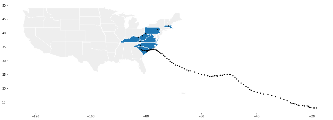
And there is our graph! Notice the “hard” part about this is actually not the plotting at all! The plot itself doesn’t use anything more advanced than what we saw in the previous lesson! Instead, what is difficult to do was to get the right data so that we can plot it by using sjoin.
In the next lesson, we will how this spatial join is actually implemented fairly efficiently using a special data structure called a “tree”.