Hurricane Florence
Contents
Hurricane Florence#
Jupyter Info
Reminder, that on this site the Jupyter Notebooks are read-only and you can’t interact with them. Click the button above to launch an interactive version of this notebook.
With Binder, you get a temporary Jupyter Notebook website that opens with this notebook. Any code you write will be lost when you close the tab. Make sure to download the notebook so you can save it for later!
With Colab, it will open Google Colaboratory. You can save the notebook there to your Google Drive. If you don’t save to your Drive, any code you write will be lost when you close the tab. You can find the data files for this notebook below:
You will need to run all the cells of the notebook to see the output. You can do this with hitting Shift-Enter on each cell or clicking the “Run All” button above.
Overlay - Hurricane Florence#
The power of geospatial data is it allows you to combine many different types of data as long as you can “line up” how they occur in the real world. For example, the country dataset below holds the geometry for various states in the United States. The second dataset stored in the florence variable is a plain DataFrame that stores information about the the hurricane at various points in time.
In this example, we will plot the data on top of each other to compare them. As a preview to a future lesson, we will next take this a step further to also highlight which states were hit by hurricane Florence.
We start with our imports for this notebook and then loading in the two datasets.
import geopandas as gpd
import matplotlib.pyplot as plt
import pandas as pd

# A special command for Notebooks to get the plots inline
%matplotlib inline
country = gpd.read_file('gz_2010_us_040_00_5m.json')
country.head()
| GEO_ID | STATE | NAME | LSAD | CENSUSAREA | geometry | |
|---|---|---|---|---|---|---|
| 0 | 0400000US01 | 01 | Alabama | 50645.326 | MULTIPOLYGON (((-88.12466 30.28364, -88.08681 ... | |
| 1 | 0400000US02 | 02 | Alaska | 570640.950 | MULTIPOLYGON (((-166.10574 53.98861, -166.0752... | |
| 2 | 0400000US04 | 04 | Arizona | 113594.084 | POLYGON ((-112.53859 37.00067, -112.53454 37.0... | |
| 3 | 0400000US05 | 05 | Arkansas | 52035.477 | POLYGON ((-94.04296 33.01922, -94.04304 33.079... | |
| 4 | 0400000US06 | 06 | California | 155779.220 | MULTIPOLYGON (((-122.42144 37.86997, -122.4213... |
country.plot()
<AxesSubplot:>
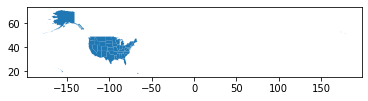
This is a VERY tiny graph because it’s trying to show states not in the mainland. It turns out, the visualization won’t involve Alaska or Hawaii, so we leave them out of this analysis for clarity.
Note, this comes back to the discussion of how a data analyst has to choose what they include/exclude (e.g., what they deem “relevant”), which is where a lot of tricky biases can sneak in. Think carefully about the assumptions you make in an analysis and the impact of potentially excluding some aspect of the data.
We start by filtering out the rows for Hawaii/Alaska.
country = country[(country['NAME'] != 'Alaska') & (country['NAME'] != 'Hawaii')]
country.plot()
<AxesSubplot:>

Now let’s load in the data of hurricane Florence. This is stored in a plain-old CSV so we read it in with pandas.
florence = pd.read_csv('stormhistory.csv')
florence.head()
| AdvisoryNumber | Date | Lat | Long | Wind | Pres | Movement | Type | Name | Received | Forecaster | |
|---|---|---|---|---|---|---|---|---|---|---|---|
| 0 | 1 | 08/30/2018 11:00 | 12.9 | 18.4 | 30 | 1007 | W at 12 MPH (280 deg) | Potential Tropical Cyclone | Six | 08/30/2018 10:45 | Avila |
| 1 | 1A | 08/30/2018 14:00 | 12.9 | 19.0 | 30 | 1007 | W at 12 MPH (280 deg) | Potential Tropical Cyclone | Six | 08/30/2018 13:36 | Avila |
| 2 | 2 | 08/30/2018 17:00 | 12.9 | 19.4 | 30 | 1007 | W at 9 MPH (280 deg) | Potential Tropical Cyclone | Six | 08/30/2018 16:36 | Avila |
| 3 | 2A | 08/30/2018 20:00 | 13.1 | 20.4 | 30 | 1007 | W at 11 MPH (280 deg) | Potential Tropical Cyclone | Six | 08/30/2018 19:44 | Beven |
| 4 | 3 | 08/30/2018 23:00 | 13.2 | 20.9 | 35 | 1007 | W at 13 MPH (280 deg) | Potential Tropical Cyclone | Six | 08/30/2018 22:42 | Beven |
florence.plot()
<AxesSubplot:>
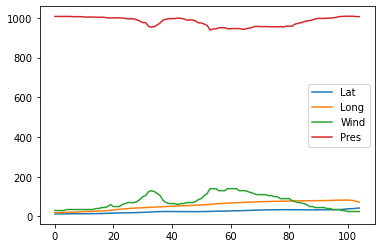
Huh, this doesn’t look like the path of hurricane Florence at all! In fact, this data viz doesn’t really tell us much at all! The reason is this pandas.DataFrame doesn’t have any notion of geospatial data. Even though there are columns for the longitude (Long) and the latitude (Lat), it is just plotting them as if they were any other numeric column!
To fix this, we will need to turn it to geopandas.GeoDataFrame. In order to do this, we will need to construct a Point geometry since each row corresponds to a single point where the hurricane was. We will create a new column called coordinates that stores these Point objects from the shapely library of geometric shapes. The code to do this is relatively complex so do not worry too much about understanding it. If you’re curious how we turn the Lat and Long columns to these points, we explain the following code:
ziptheLongandLatcolumn to get a series of(long, lat)pairs.Loop over this generator and create a
Pointfor each one. As a technical note, we need to negate the longitude because our US dataset stores longitudes for the US as negative values.Store the resulting
Points in a new column offlorence.
from shapely.geometry import Point

# Add new-lines for clarity
florence['coordinates'] = [
    Point(-long, lat)
    for long, lat
    in zip(florence['Long'], florence['Lat'])
]
We can then convert this to a geopandas.GeoDataFrame with the following cell. Notice the new column coordinates stores the geometry for each row!
florence = gpd.GeoDataFrame(florence, geometry='coordinates')
florence.head()
| AdvisoryNumber | Date | Lat | Long | Wind | Pres | Movement | Type | Name | Received | Forecaster | coordinates | |
|---|---|---|---|---|---|---|---|---|---|---|---|---|
| 0 | 1 | 08/30/2018 11:00 | 12.9 | 18.4 | 30 | 1007 | W at 12 MPH (280 deg) | Potential Tropical Cyclone | Six | 08/30/2018 10:45 | Avila | POINT (-18.40000 12.90000) |
| 1 | 1A | 08/30/2018 14:00 | 12.9 | 19.0 | 30 | 1007 | W at 12 MPH (280 deg) | Potential Tropical Cyclone | Six | 08/30/2018 13:36 | Avila | POINT (-19.00000 12.90000) |
| 2 | 2 | 08/30/2018 17:00 | 12.9 | 19.4 | 30 | 1007 | W at 9 MPH (280 deg) | Potential Tropical Cyclone | Six | 08/30/2018 16:36 | Avila | POINT (-19.40000 12.90000) |
| 3 | 2A | 08/30/2018 20:00 | 13.1 | 20.4 | 30 | 1007 | W at 11 MPH (280 deg) | Potential Tropical Cyclone | Six | 08/30/2018 19:44 | Beven | POINT (-20.40000 13.10000) |
| 4 | 3 | 08/30/2018 23:00 | 13.2 | 20.9 | 35 | 1007 | W at 13 MPH (280 deg) | Potential Tropical Cyclone | Six | 08/30/2018 22:42 | Beven | POINT (-20.90000 13.20000) |
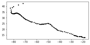
florence.plot()
<AxesSubplot:>
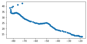
And now it prints out the path of the hurricane! Remember, understanding the details of the transformation from lat/long columns to a single column is not important. What is important to understand is you need to make a GeoDataFrame if you want to leverage geospatial displays/processing.
Plot the Hurricane#
So now that we have our country data and florence data, let’s try plotting them together to see where the hurricane hit the U.S. We pass in an extra parameters to the florence plot to make the dots black and a bit smaller.
country.plot()
florence.plot(color='black', markersize=10)
<AxesSubplot:>
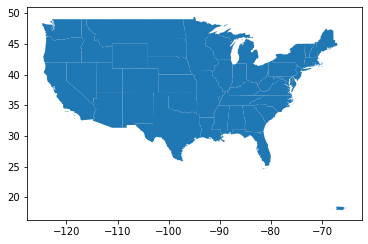
That dooesn’t look right! Why didn’t they plot on top of each other?
Remember, by default plotting functions generally make a new figure so each plot will end up being completely separate. To fix this, we need to make a figure with a single axes, and have both plots draw on that axis. We pass in an additional parameter figsize to make the figure slightly larger.
fig, ax = plt.subplots(1, figsize=(15, 7))

country.plot(ax=ax)
florence.plot(color='black', markersize=10, ax=ax)
<AxesSubplot:>
That looks much better! This can show the power of geospatial data, since it very naturally lets you overlap data if they occur in the same location in the world.
Next time, we will pick up with this example and do something more complex that involves highlighting which states intersect with the hurricane’s path!
Recap#
geopandas.GeoDataFramelets you make plots that capture geospatial information.If you want to plot multiple plots on the same axes, you need to explicitly make a
FigureandAxesand pass the axes in.(Less important) Unless your data comes in a geospatial format, converting them to one can be pretty tedious.